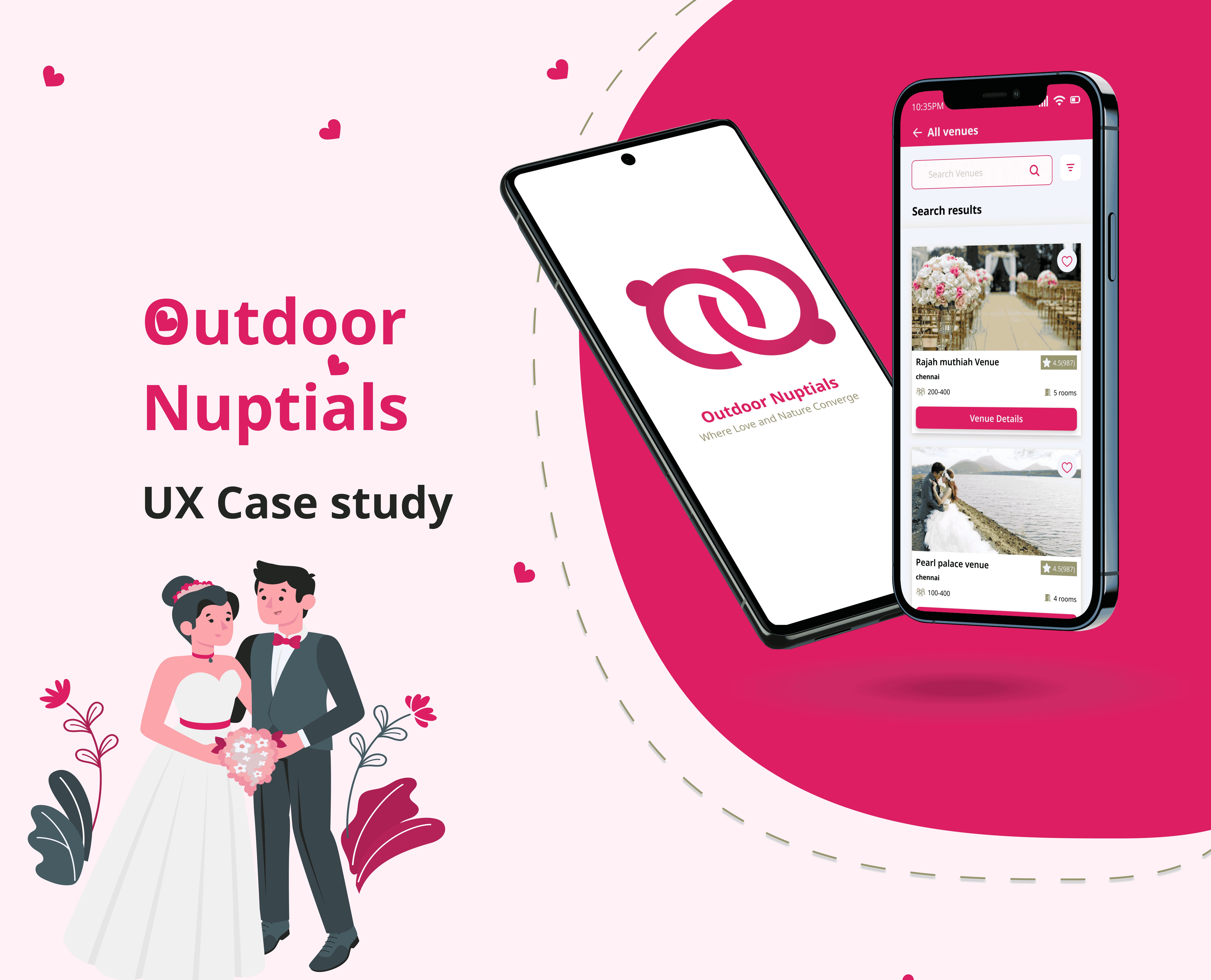
Category:
Web Design
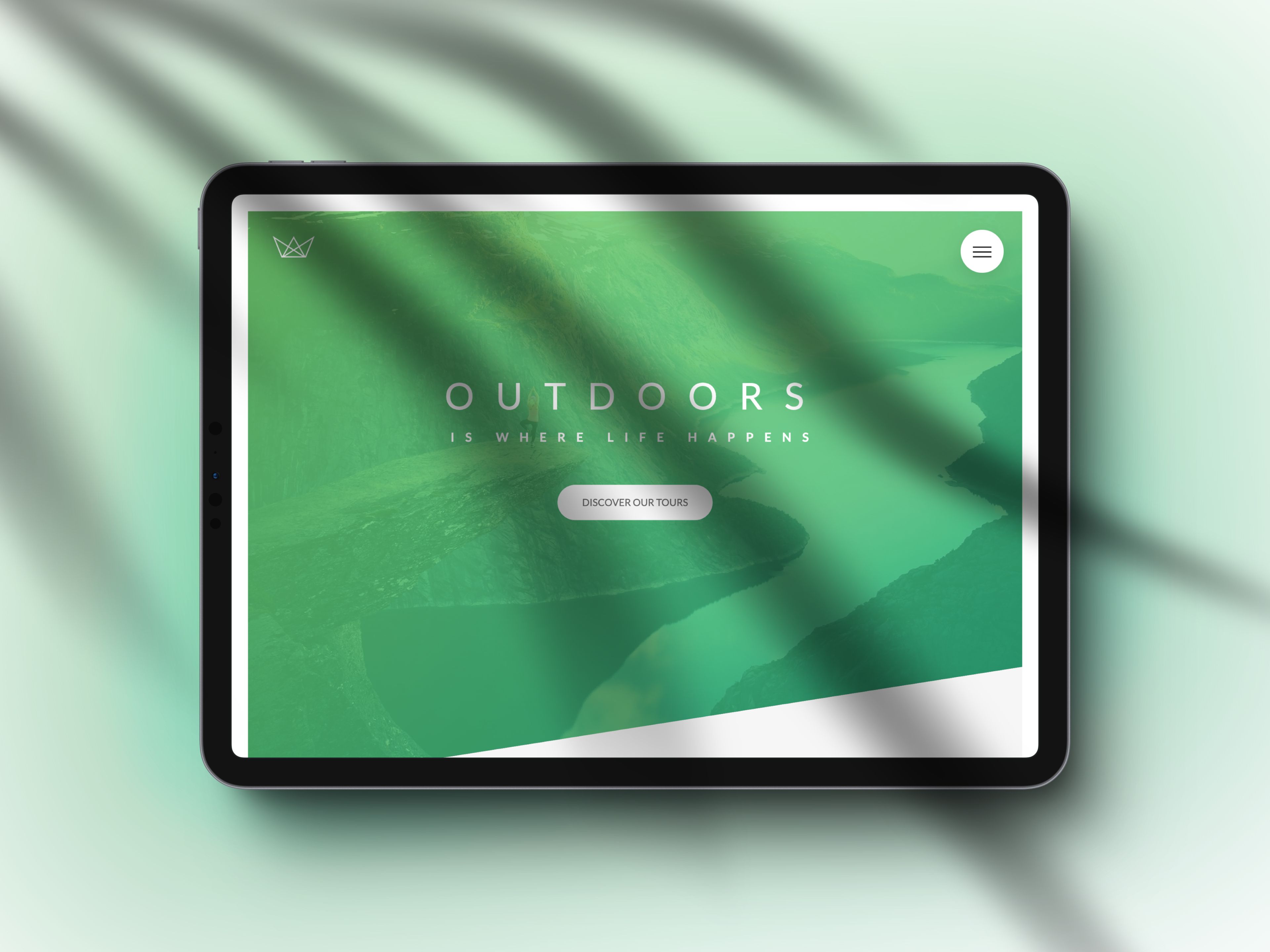
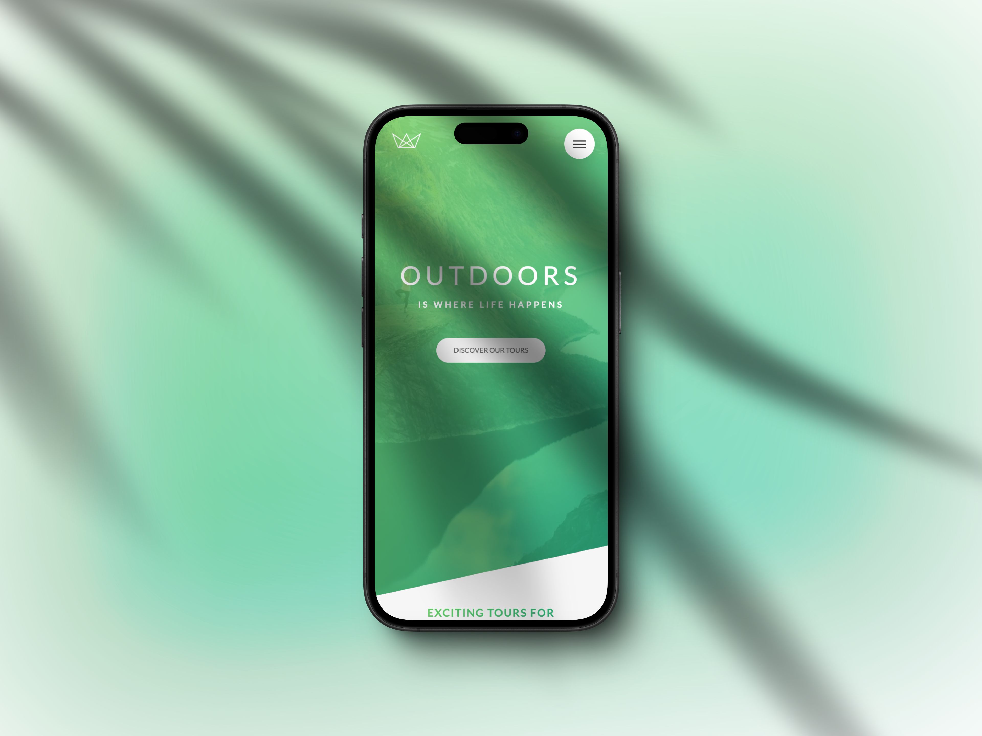
Client:
Natours

🧠 Summary
This case study evaluates Twitter's "Topics" section using heuristic principles to enhance usability. The key solution — adding a search bar — improved information discovery, user satisfaction, and overall efficiency.
❗️Problem Statement
Twitter users face difficulty in finding relevant Topics due to the lack of a search function. The interface forces users to scroll and scan extensively, which reduces efficiency and leads to user frustration.
✅ Solution
🔎 Add a search bar in the Topics section to:
Save users’ time
Improve personalization
Enhance satisfaction and engagement
Increase long-term retention and session metrics
🔧 Design Process
Methodology Used: Design Thinking + Heuristic Evaluation
Day 1: Research, Define, Ideate
Day 2: Prototype, Usability Testing
Day 3: Final Solution
Role: UI/UX Designer (Individual Project)
Tools: Figma, Marvel, Google Meet
🧪 Heuristic Evaluation Principles Used
Heuristic PrincipleApplicationRecognition rather than recallInformation is now searchable instead of being memorized or scanned.Flexibility and efficiency of useSearch bar allows quick access to specific topics.Aesthetic and minimalist designCleaned up interface for easier scanning and interaction.
📊 Research Insights
Topics are selected by ML algorithms based on engagement (tweets, likes, replies).
Users still struggle to discover topics not prominently displayed.
Scroll-heavy UI leads to information overload.
🔍 Define
User Pain Points:
Difficulty locating specific topics.
Limited to only viewing preset options.
Wasted time and effort when searching manually.
Goal: Empower users to search and discover interests with ease.
💡 Ideation
🔎 Search Functionality – Add a search bar in Topics
📢 Social Sharing – Let users share interesting topics externally
🎨 Prototyping
Created:
Low-fidelity wireframes (for structure)
High-fidelity mockups (for visual polish)
🧪 Usability Testing
Task: Search for a topic using the current UI and the new prototype
Test Scenario | Current UI | New Prototype |
|---|---|---|
Ease of search | Scroll + guess | Search & find instantly |
User feedback | Hard to locate topics | Felt intuitive, saved time |
Visual feedback | Cluttered dropdown | Improved with solid background |
🔁 Iteration
Changed the search bar background from transparent to semi-solid for better readability.
Enhanced text clarity and dropdown layout based on user feedback.
🖼️ Final Screens
Key screens showcasing:
Search Bar integration
Minimal interface
Enhanced discoverability
📈 Impact
For Users | For Business |
|---|---|
Quicker topic discovery | Improved engagement |
Personalized experience | Longer session time |
Higher satisfaction | Better retention |